Custom Geocoding in Tableau
Written by Giannis Zonia - 22-03-2019
Creating maps in Tableau is usually a piece of cake. However, there may be instances where Tableau is not able to understand your data. This is where this article comes in – to show you how to help Tableau map your data.
To get a better understanding of the geographical roles that exist in Tableau, and the locations that will be automatically recognized and assigned specific roles, you can read this article provided by Tableau, which explains everything thoroughly.
In order to ensure that your location data does not fit into one of the roles specified in the aforementioned article, then you will need to Custom Geocode your data. If this is the first time that you have encountered those two words then it is recommended that you keep reading.
In this article, we will examine five different possible solutions with different uses, difficulty levels, advantages and disadvantages.
Solution 1 - Change Tableau’s settings
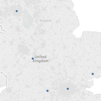
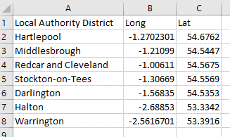
The first solution differs from the rest as it might actually save you from the trouble of doing Custom Geocoding by adjusting a couple of Tableau’s settings. As an example, I connected to a simple .csv file which can be seen below. The file contains five different cities of the United Kingdom, along with the title of the field.
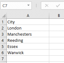
By connecting to the file, Tableau automatically gives the field the Geographic role of a City because of the name of the column in the Excel file. Keep this in mind, as it will be used later on when we will create our own geocoding files.
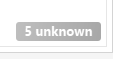
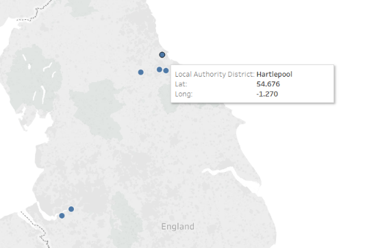
Now, in theory, by double-clicking the City dimension, Tableau should have automatically generated a map representing those cities. However, instead of that, Tableau returns an empty map with the following message on the bottom right of the screen:
If you click on the message you will be given the options to “Edit Locations…”, “Filter Data” or “Show data at default position”. In this case, we will go with the “Edit Locations…” option. As soon as you select that option, the following menu will appear:
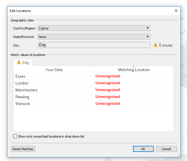
As you can see, Tableau does not automatically understand the cities listed due to the fact that the selected Country/Region is Cyprus. Therefore, we need to change that to “United Kingdom”.
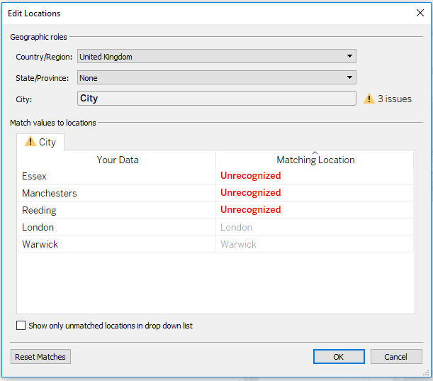
Those of you who are really observant may have already spotted the spelling mistakes in the names of the cities. Of course, that was intentional because you might be in a situation where the selected Country/Region is correct, but Tableau still does not understand the locations. To fix that, you double click on the “Unrecognized” text, type in the correct name, or the longitude and latitude, click OK...and there you have it.
Solution 2 – Create your own geocode file
So the first solution is not working? Well, it’s time to dive into custom geocoding then. What we will do here is create our own file with the locations we are interested in, along with their longitude and latitude. Do not worry about finding the coordinates, as they are a single Google search away. As we mentioned in our introduction, in order to go into the effort of creating your own geocode files, you are probably interested in locations that aren't already built into Tableau.
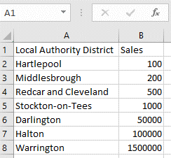
In our case, we are interested in a number of Local Authority Districts in the UK – a geographic role that does not exist in Tableau. To visualize those Districts on a map, I created the following .csv file:
Something to keep in mind is that you do not have to re-invent the wheel! The data you are looking for is probably available online, so just search for it. There is no need to manually type in the records one-by-one.
As soon as we connect to the file, Tableau creates the Dimensions and Measures seen below:
We can see that LAD is not a built-in geographic role because Tableau recognizes it as a String. Therefore, in order to create a map, we double-click on Latitude and Longitude, and drag the Local Authority District dimension on the Detail Marks.
It is worth mentioning that if you use this solution, you will not be able to turn a symbol map into a filled map due to the lack of information. If you are interested into filled maps, I suggest you look at Solution 4 or 5.
Solution 3 – Create your own geographic role and import the file to Tableau
This solution is fairly similar to the previous one in terms of file creation, structure and rules. The main difference lies in the way you import the file to Tableau. Instead of connecting to the file, we are going to import it into Tableau, and create a new Geographic Role. Some important information to keep in mind is as follows:
i) The first column of the file will be the new geographic role, and the name of the role will be the column’s title.
ii) The columns with the coordinates MUST be given the names “Latitude” and “Longitude” as Tableau will not accept any abbreviations or shortcuts.
iii) You must place the .csv file in a folder by itself, or other DIFFERENT geocode files that have different geographic roles, in order to avoid any mistakes.
Using the same file with the previous solution and renaming the Long and Lat fields to Longitude and Latitude we go to Map – Geocoding – Import Custom Geocoding and navigate to the folder where the file is located. Tableau might take a while depending on the size of your file so be patient.
Now it is time for some Tableau magic. What we will do, is connect to another .csv file that contains the Sales of an imaginary company in different Local Authority Districts. The file looks like this:
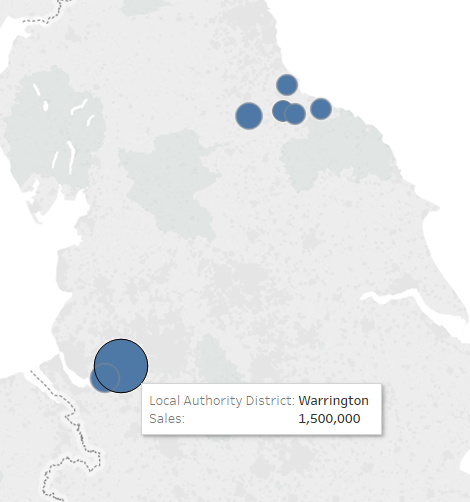
As always, Tableau creates a dimension for LAD and a measure for Sales. However, by right-clicking on the LAD dimension, and selecting Geographic Role, we are able to choose Local Authority District as a role, and turn the dimension’s type from string to geographical.

Next step...simply double click on the LAD dimension and a map will be generated. Place the Sales on the Size mark and there you have it!
You might be wondering, why use this solution and not the previous one? What are the advantages of this one? Well, the main reason is that you avoid joining your data. In the previous solution, if we wanted to include the Sales file as well, we would have to join the two files on the Local Authority District field, whereas in this case, we only connected to one file.
Finally, have a look at this article provided by Tableau that gives you a more in-depth guide on how to build your .csv file if you are looking to extend an existing role or add a new role, but at the same time still have a hierarchy.
Solution 4 – Connect to a shape file
The last two solutions we discussed only allow you to create symbol maps, as you only provide a single longitude and latitude for each location, which makes it impossible for Tableau to convert it to a filled map. Therefore, if you are interested in filled maps, this is by far the easiest way to map locations that Tableau cannot recognize. Bear in mind that you can also create symbol maps with shape files, and that you can find such files for almost any locations that you are interested in.
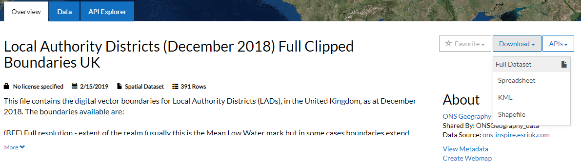
In this example we will download the Local Authority Districts UK shapefile from here by clicking the download button and then selecting the Shapefile option:
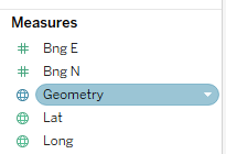
Next you should locate the downloaded .zip file, and make sure to extract the files it contains. Now all you have to do is open Tableau - Connect to - Spatial file – locate the downloaded shapefile. The great thing about connecting to a shapefile is that Tableau automatically generates a measure called Geometry where you can simply double-click it and the map is generated.
Finally, you drag the appropriate dimension such as “Lad18NM” (in the particular dataset) on the Details or Colour Marks in order to be able to individually select each LAD.
Similar to the 2nd solution, if we are now interested in adding the Sales dataset we examined earlier, we would then need to join our two files using the LAD name field, whereas in the 3rd solution we avoided all types of data joining.
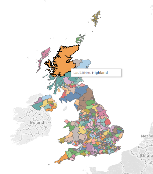
Solution 5 – Use custom polygons
Even though you can create your own custom polygons, it is highly likely that someone has already created them for you. For example, in our case we are again interested in the Local Authority Districts of the UK, and we were able to find a dataset with all the necessary information.
Below, a screenshot of the dataset can be seen, and I am sure it looks really interesting, and also odd to you, so let’s provide some further explanation.
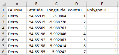
The first column specifies the name of the Local Authority District, whereas the next two are self-explanatory. The fourth column, entitled PointID, is used to tell Tableau the order in which the points should be connected. In other words, the path Tableau should take to create the particular polygon. Remember the old game we used to play, where we had to connect the dots in a specific sequence in order to create a drawing? Well, that is exactly what Tableau is doing in this case. Lastly, the PolygonID is used to tell Tableau when one polygon ends, and when another one starts. Now, let’s see that in action.
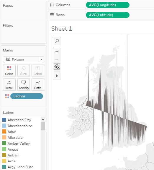
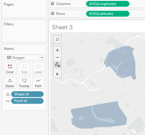
The first thing we must do is to connect to the dataset, and then drag the Longitude and Latitude fields on the Columns and Rows shelves respectively. The next step is to change the chart from Automatic to Polygon, and drag the column which includes the names of the LADs on the colour. This will return something similar to the image below:
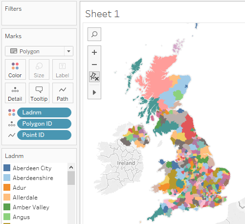
Now it is time to instruct Tableau on how to draw our polygons. In order to do this, we place Polygon ID on the Detail marks, and the Point ID on the Path marks, and we end up with our final map.
Now, what if you cannot find any existing dataset for the locations you are interested in because you created those areas? This is something we often see in surveys due to sampling and clustering. Or what if you are not interested in areas on a map, but areas on images? Perhaps something similar to what we see at the beginning of a football match on TV, where we see the lineups projected on to an image of a football pitch.
Well, for the second scenario I will leave you in the capable hands of a Tableau expert, who wrote an article specifically on this subject where he explains step-by-step how to create the dataset with the custom polygons data In which you are interested. You can find the article here.
Regarding the first scenario, we will go through this together, during which I will be using tools and techniques learnt from the aforementioned article, which is why I would recommend reading it first. So let’s get started.
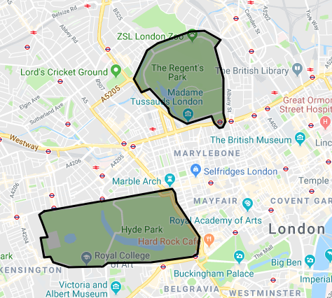
The first step is to visit this website and choose Maps on the top left side of the page. Now, it’s time to find the area you are interested in using the Google Maps extension that appears on your screen and choose the “draw a shape” icon found at the top center of the page. In this example I will be focusing on two of the biggest parks in London, Regent’s Park and Hyde Park. I will draw shapes around the two parks in order to extract their coordinates and represent them in Tableau.
As soon as you finish drawing your polygons you can see on the left that the tool has already created all of the necessary information that you will need - the shape id, point id, longitude and latitude. All we have to do now is copy the data in the format that you are interested in, import it into Tableau, and follow the steps we carried out previously, where we had the dataset for the LADs.

Extra Trick – Add you own background map
I am sure that no-one will be able to tell you that those two shapes on the image above are actually Hyde Park and Regent’s Park. This is because of the default background map that Tableau is using. Therefore, it is time to modify - or even better...change - our background map.
If the area you are interested in is in the US, then I would suggest formatting the map as Tableau already includes multiple data and map layers that you can enable which will lead to a more detailed map. To do that, you go to Map – Map layers and a new menu will appear on the left. There you will be able to enable/disable different Map Layers such as Place Names or County Borders and also add new Data Layers such as US Male/Female Ratio. This will colour your map based on the Male/Female ratio of the State/County/Zip Code or Block Group.
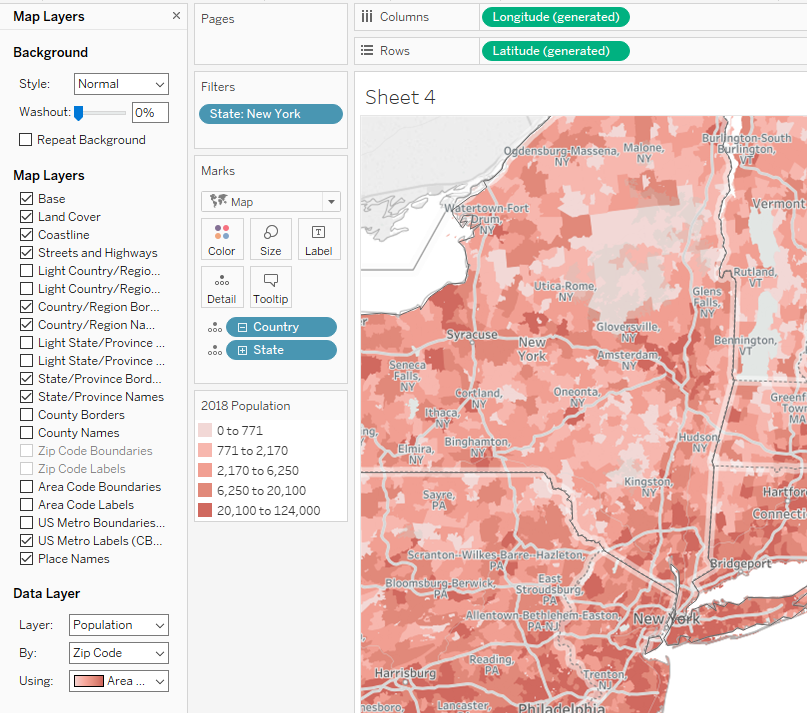
As you can see from the image above, we have enabled different new Map Layers such as Streets and Highways, Place names and US Metro Labels. In addition to that, we added a Population Data Layer by Zip Code. It is worth mentioning that even though most of the Map Layers will work for the rest of the countries as well, some of them such as US Metro Boundaries or US Metro Labels, will not. Also, the Data Layer is not available for the rest of the countries – you will be able to select one, but nothing will change on your map.
Well, what if the area you are interested in is outside the US and you still need a more detailed map than the one Tableau offers? Well, it is time to use an external map service called Mapbox.
The first thing you will need to do is visit this website and become a member. Do not worry, its is free. As soon as you are done with the registration, go to your Mapbox account where you will see your Access Tokens. There, you will find the Default public token which you will use in Tableau to connect to the Mapbox service. Therefore, go ahead and copy it.
Now let’s go back to Tableau and create the two polygons we created earlier for the Regent’s Park and the Hyde Park.
Next step is to go to Map – Background Maps – Map Services and click Add – Mapbox Maps.
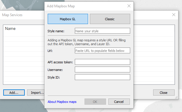
What you have to do now is to click on Classic, give the map a name in the Style Name field and paste the API access token which is the one I told you to copy earlier from your Mapbox account. Finally, select a Mapbox preset style from the drop-down menu and press OK.
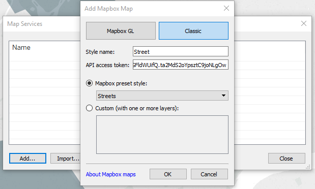
As you can see, my preferred preset style is Streets as I find it to be really similar with Google Maps.
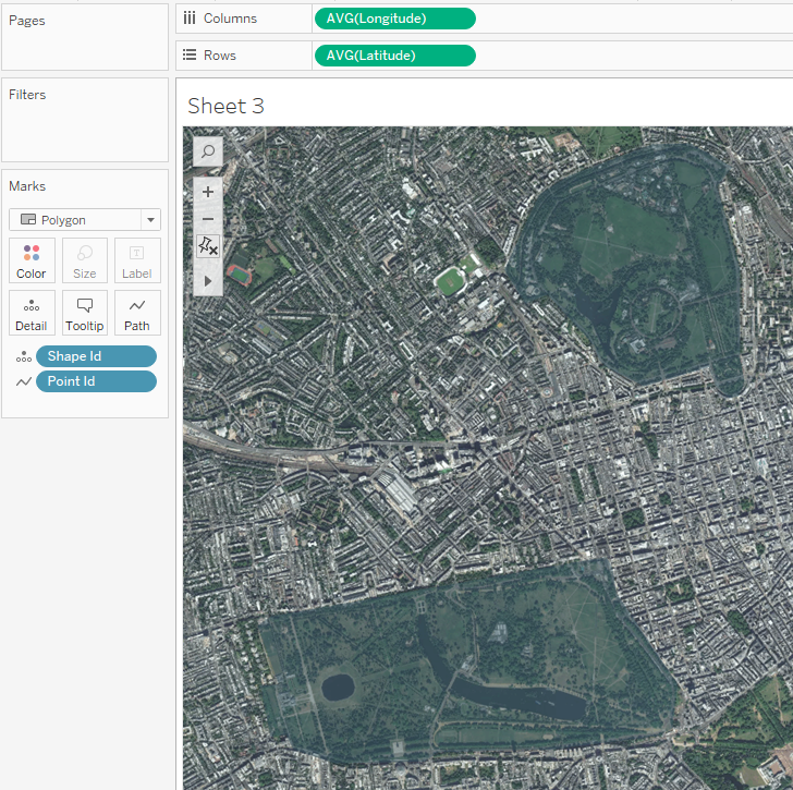
As soon as you press the OK button, your background map will change, and it will look something like this:

Clearly, it is a lot easier now to understand that those two polygons represent the two parks compared to the map we had earlier. You can also choose another Mapbox preset style such as satellite which will give you this:
Finally, in case you need to change back to the original map, you can go to Map - Background Maps and select Tableau.